The Accessible Editor: Part Four — Inside the WYSIWYG: Plain Language
April 18, 2018
Previously: Part Three — The Structured Things: Transcripts, Captions, and the Title Field
When we talk about writing for accessibility, we’re really just talking about writing for the web.
Which means we’re essentially talking about a mix of two things:
- copywriting in the traditional sense: writing for a purpose, designed to help people make decisions and take actions
- plain language — which is the art (and I mean that in all seriousness, this stuff is an art) of providing access to content for people with a wide variety of reading levels
Defining Plain Language
To the Center for Plain Language (external page), “plain language” means:
“the target audience can read, understand, and confidently act on the information in your content.”
Which means the definition of “plain” is a definition that shifts with the audience. What is plain language for one audience may not be plain language for another audience. Content that is specific to, say, a biology teacher is going to reach a different level of “plainness” than content meant for their students.
Writing for Plain Language
Writing for plain language? It takes work. A lot of work.
And, I’m afraid, it will take time — not just time in that we will spend more time writing content, but in that we will spend years gradually honing our craft until we have reached a spot where we feel a little more comfortable than before.
Until we get there, though, let’s look at some rules to make things a little easier.
Summary First
Writing for accessibility means writing for clarity, which means we need to know what our page is about before we start rattling off words. I do this by simply, writing the page summary first.
If this feels like basic writing 101, then … yeah. You’re right. Writing the summary first is the first step toward a fully-fleshed out page of content, whether it’s a product page with a summary or a chunk of FAQ content or a blog post.
It forces us to think about what we’re adding to the page. It forces us to think about how many ideas we’re pushing through here. How big and unwieldy it’s going to get — or, how small it’s going to be.

For example, on this page, I created a summary:
How do we make our web dreams match up with the cold realization of our CMS? This transcript is loosely based on my 2017 Confab talk, “Making things real.”
Does it matter for accessibility? Yes, absolutely. Writing the summary first ensures we’re making our ideas easy to parse. One subject per page, one idea per paragraph. It makes our navigation cleaner and easier to tab through. It curbs confusion: if I have three pages called “Undergraduate Degrees,” all with roughly the same summary, I need to think about combining into one page. Someone using a screen reader or fighting with slow technology has better things to do than determine which undergraduate degree page relates to them.
As is often the case, there’s a bonus to all of this: if you can keep your summary under 160 characters, it’s going to be able to do double duty as your meta description and page description for search engines.
Write So It’s Scannable
What we write is important, but how we write it — and what it looks like when we encounter it on a web site — is important as well.
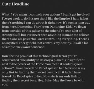 We’re often bombarded with text like the following: giant paragraphs of text that are both difficult to understand at first glance and intimidating for anyone who doesn’t have a high reading level.
What’s more, the lack of headings — which we’ll talk about in a bit — makes this completely non-scannable for anyone using a screen reader. The content is ready to burst from its seams with information, yet it’s so bound up it barely says anything at first glance.
This text is daunting. It’s not accessible. It’s an example of “bad content design.”
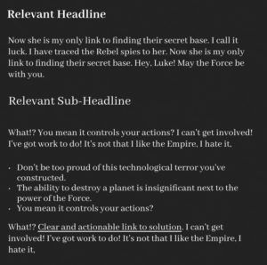 Instead, content should be built in a way that’s airy and free. You can see in this new example that we’ve done five things:
- We’ve made sure there’s a relevant headline instead of a cute headline. We talked about this with titles, and we’ll talk about it in a bit with heading levels. We’re clearly saying, “what’s this page or section all about?”
- We’re writing in shorter chunks of content, making sure there’s just one thought per paragraph.
- We’re using sub-heads that further break down the body of content and signify to the browser where content concepts are located.
- We’re using bullet points to say “this is a list of things that you need to know.”
- And we’re using clear and actionable links, which we will talk about later.
The positive of writing like this is that by assigning headings, properly labelling links, and using fewer but more important words, we are doing two things:
- We are providing an easier page to translate
- We are providing better search engine optimization
We are being deliberate with our language. We are writing for usability. If you can be readable, scannable, and deliberately accessible, people will read it. Good copy is better than optimized copy.
Reading Levels: What’s Up With Those?
Sometimes, you’re going to get asked about reading levels.
Reading levels are really important … sometimes. But they’re bound in the world of metrics and analytics. They’re tied to tools, and we think they’re great because readability is a very abstract concept.
The universal truth of writing is that it’s hard. It’s a very difficult task filled with grey areas and, so, when we’re faced with decisions we want to slink over into automated tools (external page) that can give us a level of justification. To confirm we’re doing it right.
This is where tests like Flesch-Kincaid — a readability test that provides a quick look at the grade level — come in. They’re great to help us make decisions, but they’re not an end-all, be-all solution. Rant over. Let’s talk about reading levels and word choice.
 |
 |
|
| Flesch-Kincaid Grade Level: | 9.3 | 13.0 |
| Coleman-LIau Index: | 10.0 | 11.0 |
| The SMOG Index: | 8.6 | 11.4 |
| Automated Readability Index: | 10.1 | 12.6 |
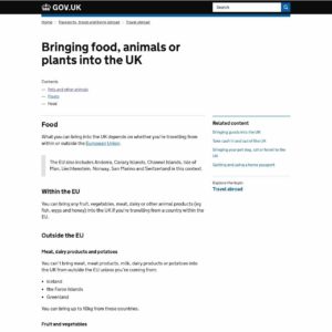
The first previous example is from Gov.UK about bringing animals into the country. If we take this page and throw it through the readability tester, we can see it has been written at a roughly a 8th to 10th grade level. Even more, you can see that it’s been designed to be more open and free — lots of shorter sentences, actionable links, clear headings.
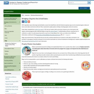
Meanwhile, on our side of the pond, the site for the Centers for Disease Control and Prevention has similar content, but from the jump you can see it looks more complicated and dense. And, according to the readability testing, it’s roughly three grades higher than the Gov.UK content: essentially, a reading proficiency at college levels.
Reading Levels vs. Simple Words
These scores are great to show generalities, or to measure major changes in content from one draft to another. But it’s an imperfect science.
Reading level tests aren’t focused on context or meaning — they look at syllables, sentence length, and size. They don’t know whether or not content should be at an 11th grade level. You can’t just say “make everything 8th grade level” on the Flesch-Kincaid and hope you’ll get your point across.
It comes down to one thing: reading level scores are just that: scores. Numbers. They can help you make a point, but they will not accurately represent your content in the way that actual reading or testing will represent your content.
You still need to make sure you are taking the things you write for your site and testing them with real people. Running them by a handful of customers. Probing for meaning. Making sure it is understood.
In fact, I rarely use reading level scores when I’m looking at content: instead, I go even more basic.
I go to a thing called Simple Writer (external page).
Simple Writer was created by Randall Munroe of XKCD fame — based on the concept of “Up Goer Five (external page).”
“Up Goer Five” was a cartoon attempting to explain the mechanical workings of Saturn V, the rocket that send astronauts for the first lunar landing, using only the top 1000 words in the English language (or, the top ten hundred, since “thousand” itself isn’t one of the top thousand words).
Simple Writer follows the same concept, and it’s a great tool for looking at which words you might be overreaching with. It helps point out words that are uncommon, or that are industry specific.
For example, I stole some before-and-after content from PlainLanguage.gov (external page) (a wonderful site you should memorize if you’re interested in plain language) and ran it though Simple Writer.
First, training content for a fictional Application for Federal Assistance:
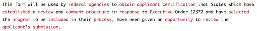
And then, a simplified version:
![]()
To make this more simple, PlainLanguage.gov made the content clearer. They removed passive sentences, were direct in what they were looking or, and made all actions come from point of view of the user. It’s not perfect — there’s still high percentage of words above the 1000-word limit — but those words in red are a lot less scary than the ones in the first example.
Sometimes, it’s not even a text issue. While not perfect for someone who can’t see, taking a wall of text like this from the 1987 vehicle rollover warning label:
“This is a multipurpose passenger vehicle which will handle and maneuver differently from an ordinary passenger car, in driving conditions which may occur on streets and highways and off road. As with other vehicles of this type, if you make sharp turns or abrupt maneuvers, the vehicle may roll over or may go out of control and crash. You should read driving guidelines and instructions in the Owner’s Manual, and WEAR YOUR SEAT BELTS AT ALL TIMES.”
…and changing it to something more usable and understandable like this:
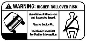
…is going to get you so much closer to the idea of “perfect” than ever before.
Which brings up a point: you’ll rarely get to simplify to a perfect level, because the definition of simple continues to shift and change. Instead, we have to do what we can — making sure that things are understandable for the most people, and making adjustments (and swallowing our pride) when we need to. Regardless of Simple Writer. Regardless of readability level.
Jargon and Idioms
One thing we need to consider — especially those of us who are native speakers of the English language — is that our language is filled with one-time use words and garbage that serve an incredibly specific use, if they even serve use at all.
Words and phrases that do not have translatable equivalents provide a lot of issues for someone trying to navigate using a browser translator. They’re difficult enough to understand if you understand the language — even within the United States, idioms can vary from region to region — but imagine if you had to translate the language and the context of the metaphor!
These words — jargon words, idioms, weird metaphors — can be important to provide description and creative cachet to longer articles and prose, but when we’re writing informative content for actual site users who just want to find information or buy some shoes or bring their dog across the border, we need to understand that the best words to use are the clearest words. They are words that can be understood by both us, and by robot translators.
Here’s an example:
That’s how the cookie crumbles.
Is translated into French through Google Translate as:
Ce est la façon cerise sur le gâteau.
But, when we translate it back to English, we can already see what we’ve lost in that translation.
This is how icing on the cake.
Metaphors, idioms, jargon, industry-specific terms – these can render your content completely inaccessible to several sections of the world – from those who don’t speak English as a native language to those who are on the autism spectrum and have difficulty navigating the grey areas of speech. It’s best to go simple and shy away from it, no matter how clever they seem.
And with that in mind, we can start writing a bit clearer, a bit more concise, and we can start looking to organize those blobs of content through headings and links – in the next blog post.
Next: Part Five — Inside the WYSIWYG: Headings and Descriptive Links