The Accessible Editor: Part Two — The Structured Things: Alternative Text
April 18, 2018
Previously: Part One — What Is the Accessible Editor?
In the next two posts, we will talk about how to write — and when to ignore — features that occur outside of the WYSIWYG editor in a site. These are the things on a site — they have some level of structure, and they are either part of the page template itself or they are hosted elsewhere.
We will talk about:
We usually talk about PDFs in this area, but that’s a topic that is either super simple or super complicated, depending on which direction you want to go. We’ll sum it up in two rules:
- Don’t use them.
- If you do, make sure they’re as accessible as an HTML page.
Alternative Text
Alternative text is the heavyweight in the accessibility world, especially when it comes to what editors can do. This is largely because it deals with a major portion of the accessibility audience (those who cannot see) and it deals with a major part of the website (the images).
Because alternative text can be easily tested by browser services like WAVE (external page), it becomes one of the identifying factors of whether or not a site is considered accessible. It gets tricked into being a “yes” or “no” issue, even if, really, alternative text is one of the greyest of grey areas – one of the most frustrating things to understand.
The rule to the letter is this: every non-text element requires a text alternative so that it can be read using assistive services.
As an example, let’s look at this page from Jade Tree Records:
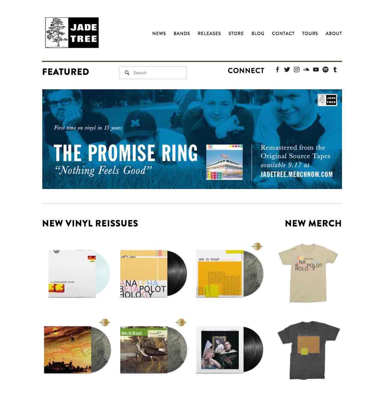
There are four areas on this page that require alternative text – the site logo, the header image, the social icons, and the products. Without those images, the content is not conveyed. Someone landing on this page who cannot see has no way of knowing what they are not seeing unless we provide a text alternative to those images.
In essence, this is exactly what image alternative text does: provide a text alternative to every image that is necessary for understanding the content. As these images are encountered on a page using a screen reader, they are read aloud and they still convey the same ideas.
Alternative text is most often added within the CMS itself. For example, in Drupal, if you upload a file within the media manager, you are given a field to fill out. This will provide alternative text, in most cases, whenever this image is used within a template. For images added within the WYSIWYG editor, there’s another field you would use.
What this does is provides a tag for screen readers to understand: alt=“text to be read”.
Writing Alternative Text
Ultimately, writing alternative text depends on the context of the image, but is essentially boils down to this: alternative text conveys necessary information at a level that someone who can see the image might get. (We’ll get into the idea of “information” in a bit, but first some examples.)
Please note: there are a thousand different examples, but we aren’t able to get to all of them in this presentation – refer to the notes after each section for detailed how-tos.
Text in Image

For example, with this image it’s pretty easy. The slide actually has text in it, so the information we need to convey is the text within that slide. The text in this example would be: alt=“first time on vinyl in 15 years, the promise ring, nothing feels good, remastered from the original source tapes, available september 17th at jade tree dot merch now dot com”.
A side note: remember that browser robots with no understanding of context will read your alternative text. So, when you write out alt text, do not forget that you actually need to write out the “dot” in dot com. If something is using an acronym, like R E D, that also needs to be spelled out with spaces. If anything, read the alternative text out loud as if you had no idea of context to see if it’s reading correctly, or, run it through a browser screen reader to confirm.
Otherwise, pretty obvious. Let’s move on.
Tables and Charts
Tables and charts can be tricky because there is a lot of information that needs to be conveyed. We won’t get into long text descriptions, but instead will talk about ways to make this work within the alternative text.
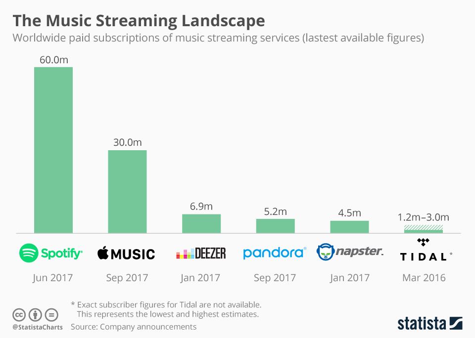
This image, from a 2017 post titled “The Music Streaming Landscape (external page),” shows actual data. Which means we need to integrate that data into the image alternative text. That’s a lot of data, though — our alternative text would be way too long, despite that being the easiest thing to create.
Our alternative … um … alternative text options are as such:
- Remove the data from the image and place it outside of the image in a way that’s accessible for a screen reader. This can be a table, a text description within the content, or some other type of readable content. In this case, the alternative text for the image would be: alt=“chart depicting the number of paid subscriptions for various music streaming services — see following table for data”.
- Host the data on a separate page, or further down the page using anchor links. Then you can actually *link it *within the alternative text, like in this example: alt=“chart depicting the number of paid subscriptions for various music streaming services — view table data”.
Standard Images
Both of the previous examples are, really, edge examples. Let’s dive into a more common example: just a plain, old, ordinary image. No text, no data: just the image.
Writing this kind of alternative text provides context issues because it depends solely on us interpreting the details required to make the image useful. This goes back to what I mentioned before: we’re not tasked with describing the image itself, but tasked with describing the information that image is attempting to portray.
In some cases, it’ll be easy. A plate of pancakes is always going to be a plate of pancakes. But for others, like in the following example, we have to think deeply about what the purpose of the image actually is.
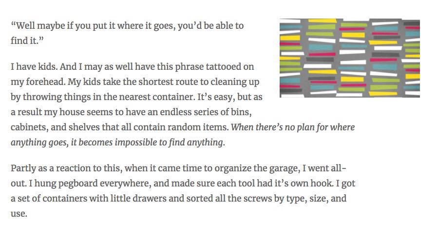
You could write alternative text in several different ways.:
You could make it a short, fast description of the image.
alt=“a bunch of boxes”
You could painstakingly describe it in detail.
alt=“five columns of non-symmetrical boxes with between ten and twelve boxes in each column with randomized colors, including green, blue, white, red, black, yellow, on a grey background”
Or, you could provide a description tied to the purpose of the image.
alt=“a grid of differently colored boxes illustrating order among chaos”
Most of the time, you’re going to land there in the middle, with alternative text that describes the purpose of the image. In this case, there is contextual information in the image that you can’t really fully describe by simply describing each item in a painstaking way.
Some Quick Final Hints
Some fast final quick hints on writing alternative text.
First, there’s no need to write “picture of” or “image of.” These are already implied by nature of them being, you know … images.
Second, keep things short. Screen readers can actually cut off text, so make sure you keep your text roughly around 100–125 characters. (Still, this is a guideline and not law — use your best judgement.)
Even then, it might come down to something beyond the alternative text itself. For example, the text on the slide we featured above is way too long. In this case, the answer isn’t to make the alternative text shorter, but to actually re-word and pull the words from the slide itself.
Finally, make sure your CMS install doesn’t allow for filename fallbacks. What this means is that when presented with a blank alternative text tag, your CMS understands to keep that blank. We do not want the CMS seeing a blank tag, attempting to “help,” and then reading the closest possible thing it can fine — usually the filename. Otherwise, you end up with something like this:
TRANSCRIPT: “digital art 1444990_640”
This is very bad. This is much worse than having no alt tag at all. In this case, you specifically wanted the alt tag to be blank, and the CMS has, under the guise of helpfulness, changed your field.
Wait … hold on.
Corey, you’ve just told just told us that you need alternative text … but now you’re saying sometimes they’ll be blank?
Yes. Welcome to the real troublesome part of alternative text …
The Exceptions: Ignoring Alternative Text
Welcome to the grey area of inclusion, which can be a tricky line to balance. Creating accessibility in our images is not as easy as blanketing every image with alternative text.
Remember: the idea of alternative text is to create an experience that mirrors the visual experience, but in order to do that we need to understand how images and graphics are used on a website.
First off, we have to understand that not every image is necessary to the site itself. Not every image is sacred. Some images are what we call decorative, and some are considered structural. These are things that, as we roll through a site, scanning with our eyes, we zip right past — they may offer some level of graphic ambiance, but they do not present any actual content and, therefore, we do not encounter them outside of a general feeling.
 For example, there is structural content. The common example of this is graphic layout — horizontal lines as images, footer barriers, things of this sort. These are not here to provide content, but to add to the design itself — they should be invisible. They should not be read. They should be ignored. The following example includes a graphical flourish that has no need to be read.
BUT, every image requires an alt tag, otherwise a screen reader will look at it and scream WHAT EVEN IS THIS??? So what we do is we provide a blank alt tag.
alt=“ ”
From the editor side of things, you will rarely need to worry about this — these are nearly always baked into the template itself. The same with templates that include images and descriptive text within the body. Examples include:
- A directory that includes the name of the person next to their image.
- A caption on an image within a publication.
- An icon that sits alongside a heading.
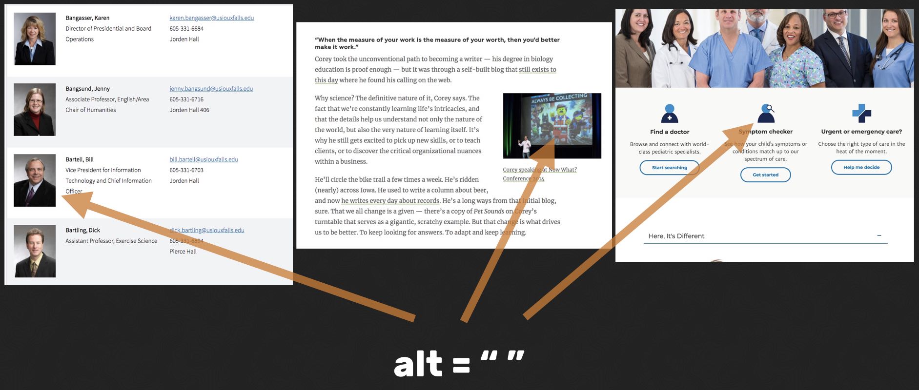
In these images, where the text is nestled up next to the image itself, there is no need for alternative text. The reason for this goes back to the reason behind alternative text in general: it provides explanation for images that cannot be seen for whatever reason.
In all of the above cases, the explanation is already there — it’s in the title, or it’s in the name. In fact, in all of these cases, providing alternative text to the images adds a layer of noise to the page — instead of simply reading this person’s name, or this caption, it’s reading the person’s name AND the alternative text. Which means you get something like this:
TRANSCRIPT: “A red panda next to a bamboo tree a red panda next to a bamboo tree.”
Finally, alternative text can be skipped if the image provides no communication value outside of page decoration. And the grey areas become even more grey, because where this line is drawn is still largely a matter of opinion and editorial judgement.
There are some that believe a university carousel slide or page hero of students under trees conveys necessary information – it provides a feeling for campus life, and it helps students visualize themselves on campus as a student.
And then there are others (and I often find myself in this camp) that feel while these are nice accent pieces that provide a way of breaking up the page and providing a splash of color, they have little to no contextual value to the content on the page.
Thankfully, you don’t have to make these decisions alone: there’s the alt Decision Tree (external page), created by the Web Accessibility Initiative. It describes how to use alternative text in various situations, from an image with text inside of it to the most vague decorative imagery ever posted.
It’s wildly useful in helping you make the hard decision of when you might need to skip alternative text, which is always going to be a lot more often than you originally thought.
Alright. Enough about alternative text. Kind of. Our next post will dive into a different kind of alternative text — this time for moving pictures and audio — as well as a quick look at how we label things.
Next: Part Three — The Structured Things: Transcripts, Captions, and the Title Field