The Accessible Editor: Part Five — Inside the WYSIWYG: Headings and Descriptive Links
April 18, 2018
Previously: Part Four — Inside the WYSIWYG: Plain Language
We’ve talked a lot through this series about writing for humans to understand. And we’ve talked about the fields that we use to give order to our content so web browsers can translate them for screen readers.
Now we’ll take a look at two shortcuts assistive technology use to navigate and glean value from the blob of the WYSIWYG editor: headings, and descriptive links.
Headings: The Outline of Your Content
Headings within the WYSIWYG are most often seen as section headings and sub-headlines. We see them used within long-form content — like this, series of blog posts, for example. That text you just encountered before this paragraph? That’s a heading that reads “Headings: The Outline of Your Content.”
Headings are important to provide order to the sections of our content. But, while to a fully-sighted person they look largely decorative, headings actually provide a deep level of understanding for web browsers.
Think back to middle school, where we all learn the basic construction of an essay. Introduction. Three supporting paragraphs. Conclusion. By constraining to these five sections, we learn how to move beyond those sections. We better understand how arguments are made, how to frame sections as sub-sections and how to use language to stall a conclusion for just a little longer.
Until we get there, though, those five paragraphs are our life.
Web browsers, RSS feeds, search crawlers and accessibility tools also understand how a piece of content is constructed. However, unlike us, they don’t grow. They don’t suddenly gain context and understand complicated syntax – they are robots, and they do not think.
Which means it’s up to us to help them understand what’s important: what is the title, what are the main components, and when do we start going down the sub-thought rabbit hole.
This is where headings come in. They work as a kind of outline, and they are crucial to web browsers and assistive technology to understand the context of your page’s content.
The Order of Headings
Here’s how they work in accessibility: the H1, or first-level heading, of the page is identified as the single, overarching page topic. This is why we often use the page title as an H1 – for this blog post, the blog title at the top is the H1. For an article in the New York Times, that article title is the H1. (People using screen readers get the benefit of shortcuts: for example, those who use JAWS can press “1” on their keyboard to be taken directly to the next first-level heading.)
Then, as we go deeper and deeper into an article, we get more specific with our headings.
In essence, what we’re building is similar to how modern traffic patterns are laid out. Arterial roads are fed into a specific area of a city, and they bring the highest amount of traffic to a specific section. Once within that section, collector roads signify more specific areas, and then local roads provide hyper-specific travel within a few blocks or a cul-de-sac.
On our site, the H1 is the arterial road, which brings you the overall content idea. Collector roads are H2s, which deliver a specific section that might appeal to you. H3s and higher provide more hyper-local content.
Seeing how headings and chunks of content feed into another, you can begin to see how content loses its ability to be scanned when we use our headings out of order.
For example, when headings are used as visual cues without regard for the actual structural cues that lie below, we start creating problems. We end up with out-of-order headings for reasons that don’t consider a screen reader or search engine’s ability to navigate.
- Maybe we think the third level of headings look better than the second level of headings.
- Maybe we really like the fourth level of headings so we assign that to everything.
- Maybe our site was built without a heading level on the title, so we force it within the WYSIWYG.
When we do this, we really screw with a screen reader’s idea of place. We have, essentially, removed any accessibility for navigation through logical sections, and we have, without knowing, rearranged the priority of our content.
Oops.
Again, there are no real rules for heading levels outside of making sure they are in order. It depends on writing construction, context, and site templates. However, we usually see the following in a well-structured site.
The first thing to do with headings is largely development-focused, but it’s important to know: we have to ensure that templated areas on the page are organized in a way that keeps our headings in the right order.
- For all pages outside of the home page, the page title should be your H1.
- This means headings within your body copy should start with second-level headings for its major sections
- Then, if you need to further break apart a second-level section, you go to third-level headings, and on and on.
Within the template, any blocks that come after the main WYSIWYG editor — templated sections outside of the main content, such as blocks or components — often should start with an H2 as well. These are seen as, essentially, sections added to the end of your body copy.
Writing Headings
Just assigning headings isn’t good enough, though. We have to actually write them, and this is where we put our editorial hats on.
Largely, we’re going to treat headings in the same way we treated titles: making them concise and clear. Again, yes, they can be clever. But in doing so they also have to be understandable on their own.
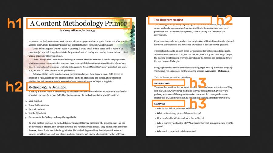
For example, this is a blog post I wrote (external link) for the now defunct (but still every much live) Contents Magazine on how to create a content strategy methodology. Because this blog post was pretty long, I needed to break it up into sections, and those sections needed to represent what the following content conveyed.
- Methodology: A Definition
- Why Methodologies Matter
- Methodologies are Personal
- Great. So How Do I Do It?
From these titles, you can get an idea of what the entire article is about. You can easily scan it. Not just you, either, but also someone using a screen reader, who can skip through the headings to navigate to the right section, or someone who doesn’t have time to dive into the entire article.
Inside Out vs. Outside In
When I write headings, I typically take a paragraph to outline approach. This matches best with how I write: a big blob of text, with sections moving around and content deleted on a regular basis. Through this, I can see logical sections and groupings cropping up — and when that happens, I give it three hashes. A placeholder for “a heading will go here, soon.”
When it gets to be time to post, I do the same thing every newspaper editor does: I assign headlines to the text.
On the other hand, if your content is highly structured — like a product page or a set of directions — you might do the opposite, and write from outline to paragraph.
In this process, the headings are already defined (or nearly so) as a part of the outline. All we have to do is fill in the outline.
Regardless of how we write, understanding the order and importance of headings helps us create content that is easier to understand — not just for those reading in the traditional way, but for those who need assistance understanding the outline and structure of the page. And while screen readers may use headings to navigate the page, there’s another thing that provides easy tab access to content in the page: links.
Which brings us to the need for descriptive text links.
Descriptive Text Links: Beyond “Click Here”
Where headings are designed to be scannable and assist with navigation, links are designed to actually take you elsewhere — and, they become the other fast navigation method for someone using both assistive technology and someone simply using their keyboard to move around the page.
What this means is that sometimes people will only see or hear the text of the links you create. None of the contextual information around it. None of the paragraphs before or after. Just the text of the link.
So when someone tabs through, they might hear this:
TRANSCRIPT: “Neil Armstrong, link. Buzz Aldrin, link. Lunar module, link.”
Because the text of the links are the only thing heard in these situations, it’s obvious that what we put in those links is more important. The text of the link itself makes a promise – it’s a promise that says, “This is what you’re going to see or hear when you activate this link.”
So when I hear the screen reader say “Buzz Aldrin,” I know that it’s going to Buzz Aldrin. When I hear it say “lunar module,” I know I”m going to learn about a lunar module.
We’re not going to dive into the obvious things here — there are plenty of talks and articles talking about why “Click Here” and “Read More” are largely useless as descriptive link text. We just need to go forward knowing that good link text is a by-product of good writing — writing descriptive text links doesn’t need a full-scale reworking of our content. It just needs to be clear in saying what it’s leading to.
The best way to show that is by showing two examples of when descriptive link text was done incorrectly.
Link Text Should Be Clear: One Thought Per Link
Over the past few years, the concept of a link as emphasis or footnotes rather than a delivery method to a related page has manifested as a cute little blogging trope: the multiple links per thought link stream.
Here’s an example.
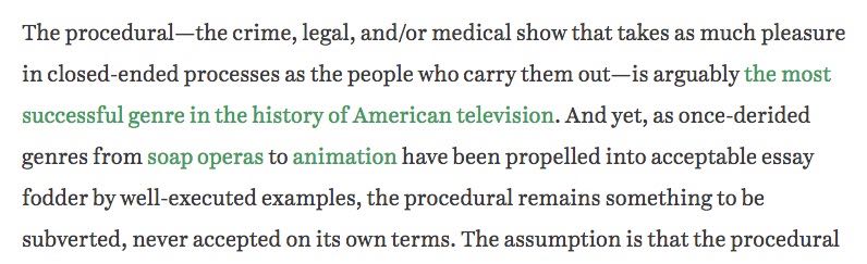
This is an article about the rise/staying power of the procedural television drama. It includes this thought — that procedurals are arguably the most successful genre in the history of American television — but instead of giving examples within the text, the author wrote the thought (and a thought in the next sentence) as three links that actually are made up of 13 links.
Seems fun and even clever, until a screen reader encounters them, when this is what you hear:
TRANSCRIPT: “The, link. Most, link. Successful, link. Genre, link. In, link. The, link. History, link. Of, link. American, link. Television, link.”
The links are completely useless, especially if a user tabs through them. And, what’s more, the writing is flawed — without clicking on the links, I don’t even get access to the examples the author is using for their argument!
The right way to write this would have been to use either fewer examples, writing them out as a part of the article, or to provide a list that could be tabbed through. Which means the above would end up being written something more like:
…is arguably the most successful genre in the history of American television, as shown by classics like NYPD Blue, Law & Order, CSI, and NCIS…
In this fix, I clearly see where I’m going when I click on the link.
Link Text Should Be Short Enough To Make a Promise
On the other hand, you have long or over-descriptive link text, like this example from a recent Metafilter post.

The issue here is that the link literally transcribes the tweet, but it doesn’t give any relatable information — it does not give the essence of the story, the purpose of taking you off-site, or even the fact that it’s actually anything more than just this tweet. Additionally, it’s a bit of a bear to get through with a screen reader:
TRANSCRIPT: “A wee old women came in and said quote I’ve a question. Why does page 7 in all the books I take out have the seven underlined in pen? It seems odd quote. Quote what quote I say, thinking she might be a bit off her rocker. She showed me, and they did link.”
In this case, the link should have been written as a separate sentence after the tweet. Something like:
A wee old women came in and said “I’ve a question. Why does page 7 in all the books i take out have the 7 underlined in pen? It seems odd.” “What?” I say, thinking she might be a bit off her rocker. She showed me, and they did. The full thread tells the story of an old library secret code for remembering books.
A Few Notes About Link Media
All of these examples were taking users to text pages, and that’s cool – text pages are text pages. But what happens when we’re linking to a PDF? What happens when we’re linking to a video? What happens when we need to prepare our site users for something even more unexpected?
![]() Simply put: we have to be honest. We have to tell site users when they’re going to a PDF, when they’re going to a video, and when they’re going off site.
Simply put: we have to be honest. We have to tell site users when they’re going to a PDF, when they’re going to a video, and when they’re going off site.
The best way to do this is to have your site set up in a way that makes things automatic, if possible. For example, you’ve probably seen sites with PDF icons or external link icons — those are often programmed into the site itself to say “you are going to an external site.”
The trick here is that there’s a little bit of alt text assigned to the icon itself, or the site has been programmatically created to have a little note inserted into the link as its read.
If you don’t have anything specific like this built in, you can still approximate it pretty easily by just adding that to the link.
The Link Text (PDF Download)
or
The Link Text (External Site)
Now, when the link is read, it will include the text in parenthesis. Now, you’re being honest with your link target.
Next: Part Six — Some Final Thoughts