Usability (and Opening Day) break
April 5, 2010
One of the most frustrating aspects of the Argus Leader’s Web site – and let’s be fair: this is probably not an Argus thing as much as it’s a Gannett thing – is the issue of page navigation.
Exhibit 1: Underlines = Links
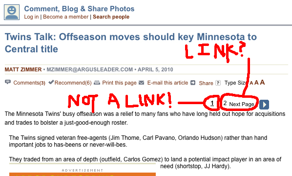
As you can see, the page I’m currently on (page 1) is underlined. One problem: common usage has led to the understanding that underlined text is a link. When you see underlined words – especially in the midst of other non-underlined words – you say to yourself, “HEY THAT IS A LINK. AND I KNOW THIS BECAUSE IT’S UNDERLINED.”
Here, though, it’s the opposite. The actual link – as in, the thing you click to get to page 2 – IS NOT UNDERLINED.
This is confusing in two ways. ONE: I don’t know where to click, and that makes me an angry clicker. TWO: When I land on this page and see the navigation, I assume I’m on page two. BUT I’M NOT, I’M ON PAGE ONE.
Exhibit 2: Completely Different

Of course, that’s not all. The page navigation of the comments section? COMPLETELY DIFFERENT.
In fact, this is how the main pages should be navigated. Current page in bold, linkable pages in a different color. Nothing is underlined, no assumptions are made, everyone wins.
So, in short: Underlined = links, especially in linkable fields. Make the page number bold, if you need to. Keep navigation consistent. Don’t be dumb.
This is simple stuff, you guys.
And, with that complaint out of the way, I’d suggest reading Matt Zimmer’s Opening Day Twins preview at the Argus Leader Web site.
Hooray for Opening Day, people. Hooray.
(Originally posted at Black Marks on Wood Pulp.)